Sometimes it’s easy to take for granted the development of things we see or work with often. Logos are like that. They are widely recognizable symbols of an organization or company and when they are well designed, they are lasting and they become an integrated part of our lives.
The American Kitefliers Association (AKA) logo is one of them.
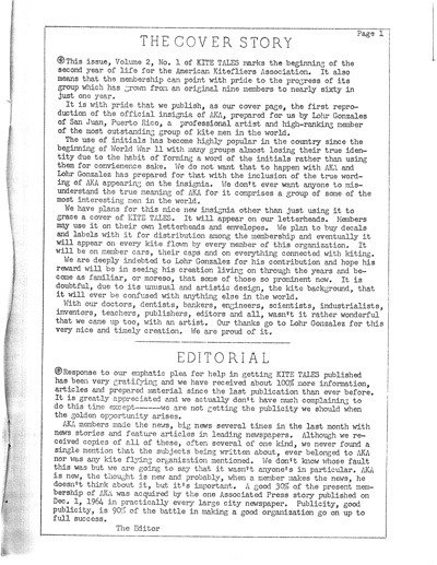
While researching an article for the upcoming issue of Discourse: from the end of the line, I had the privilege of visiting the World Kite Museum in Long Beach, WA where the AKA archives (up to 1995) are kept. It was a delightful afternoon of engrossing myself in the history of the now-largest kiting organization in the world, and I was especially interested in how Bob Ingraham got such an organization started. Tucked in the back of one of the filing cabinets I found a stack of the original Kite Tales. Hand typed and crudely mimeographed as they were, they are gems. On the front cover of Vol. 2, No. 1 October 1, 1965 is the “first reproduction of the insignia of AKA.” The logo, then only in black and white, was designed by Lohr Gonzales of San Juan, Puerto Rico, “a professional artist and high ranking member of the most outstanding group of kite men in the world.”
Thanks to Bob Ingraham and his earliest supporters, even in its fledgling year, the AKA was an internationally minded organization armed with a sharp logo and big plans.

The unveiling of the AKA logo

For more information on the AKA check out their website: http://www.aka.kite.org
AND stay tuned for the next issue of Discourse to be published mid August.

